Classname - error message
Description
The classname of the element in which the error is displayed. Leave blank for default class.
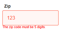
The default CSS shows the error message in red.
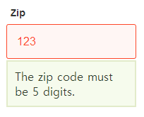
Customized CSS set using the 'Classname - error message' property
For step by step instructions on how to add a new CSS class in order to customize an error message see the Classname - field with error page. Once you have a component that can generate a validation error, assign the 'Classname - error message' property to a new CSS classname.
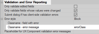
Adding a CSS class named 'errorClass'.
The CSS class can then be defined in the Local CSS definitions property.
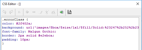
The errorClass definition