List Lookup
Description
Use a List Control (embedded in a Window container) as the source for a Lookup.
You can now use a List control as a Lookup type for a textbox or textarea. When configured, the lookup opens a window containing the specified List control. Selecting a row in the list fills the textbox with the value.
Configuration
Define a List control in your UX Component and wrap it inside a Window container.
Select the Textbox or Textarea control where you want the lookup.
In the Lookup properties section, set the Lookup type to List Control.
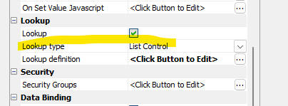 Selecting List Control as Lookup Type
Click the smart field for Lookup definition to open the builder.
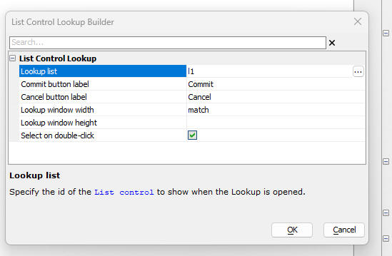 List Lookup Definition Dialog
Properties
- Lookup list
The ID of the List control to be shown. The List **must** be enclosed in a Window container.
- Commit button label
The label for the Commit button automatically added to the window footer. You can use language tags (e.g., <a5:r>).
- Cancel button label
The label for the Cancel button. You can use language tags.
- Lookup window width
The width of the window. Set to match to match the width of the lookup control, or specify a CSS value (e.g., 400px).
- Lookup window height
The height of the window. If left blank, the window automatically adjusts to fit the content.
- Select on double-click
If enabled, double-clicking a row in the List commits the selection.
Multiple Selection
If you configure the target List control to include a Checkbox column, the lookup automatically supports multiple selections. When the user commits the lookup, the selected values will be returned as a comma-delimited string.
List Control Lookup
In this video we show how to configure a List Control as a Lookup.
Watch how to use a List Lookup for multiple selection.