LogicalCheckBox Control
Description
The LogicalCheckBox is a custom UI version of a standard checkbox that allows developers to define a checkbox style control, or HTML text to indicate if the logical value is true (on) or false (off) for the checked/unchecked states.
Discussion
The LogicalCheckBox is used to display and edit logical (boolean) values. Unlike a standard system checkbox, which uses the operating system's default rendering, the LogicalCheckBox is a custom UI control. This allows you to specify the exact "look" of the check by using custom images, SVG icons, or CSS classes for both the on (True) and off (False) states.
This control is particularly useful in mobile applications where the size of the control is important to the user experience. It is possible to reduce the size to a minimal checkbox, for more screen room. Alternatively, this control can allow a larger, touch-friendly custom icon if that is preferred.
Adding a LogicalCheckBox
The LogicalCheckBox is located in [Add Control] or the [More..] section of the Data Controls toolbox in the UX Builder.
In the UX Builder, open the Data Controls menu.
Click on [More..] at the bottom of the list.
Select LogicalCheckBox from the Select Control dialog.
Configuration Properties
The LogicalCheckBox includes properties to define its appearance and behavior:
- Image - checked
Specify the image or SVG icon to display when the control value is true.
- Image - unchecked
Specify the image or SVG icon to display when the control value is false.
- Initial state
Set the default value of the control to either Checked or Unchecked.
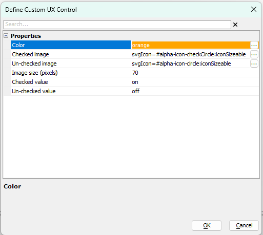
Define Custom UX Control Properties
The following properties are configured in the Define Custom UX Control dialog to specify the appearance and values for the LogicalCheckBox:
- Color
Specify the color for the control (e.g., orange).
- Checked image
Specify the image or SVG icon to display when the control is in the checked state.
- Un-checked image
Specify the image or SVG icon to display when the control is in the unchecked state.
- Image size (pixels)
The size of the images in pixels (e.g., 70).
- Checked value
The value assigned to the control when checked (default is on).
(If the value is a Javascript value like true or a number, use the {javascript} prefix. For example: {javascript}true. Otherwise, the value is treated as a string.)
- Un-checked value
The value assigned to the control when unchecked (default is off).
(If the value is a Javascript value like false or a number, use the {javascript} prefix. For example: {javascript}false. Otherwise, the value is treated as a string.)
Usage in Lists
When used within a List control, the LogicalCheckBox can be configured to behave like a switch. This is achieved by mapping the control to a logical field in the data source. The custom icons will then toggle automatically as the user interacts with the list row.
Videos
Displaying Logical Values using a CheckBox
This video demonstrates how to configure checkbox-style controls with custom images for 'on' and 'off' states to represent logical values.
See Also