Light Weight List – Dropdownbox, Edit-combo, Auto-suggest
Description
In a Light Weight List you can configure any column so that its editing control is rendered as a Dropdownbox, Edit-combo, or Auto-suggest control. This allows you to present users with picklists or typed-ahead choices rather than free text.
Overview
Each column in a Light Weight List has a configurable control type. In addition to the default textbox editor, you can choose Dropdownbox, Edit-combo, or Auto-suggest to present a list of choices to the user.
These picker controls can use either static choices or dynamically queried SQL data. Dynamic picklists may optionally be filtered based on values in other columns, allowing relationships such as “cities filtered by country” or other dependent picklists.
Editing column properties
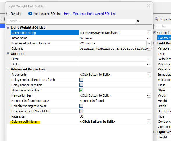
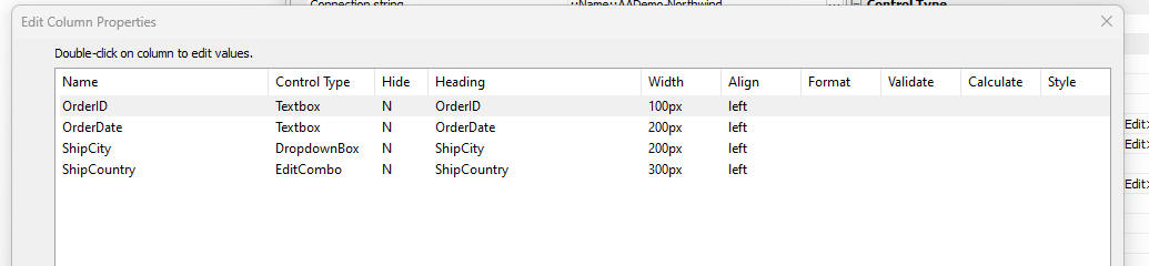
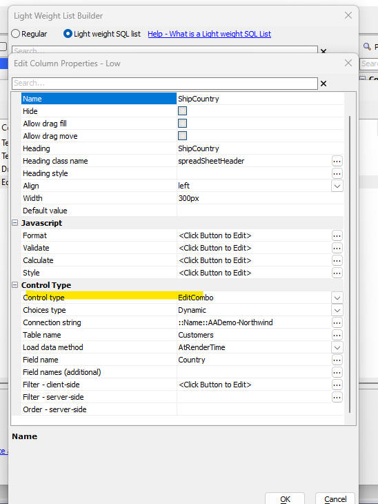
To set the control type for a column, open the Column definition dialog for the Light Weight List and double-click the column you want to configure. In the column properties, choose the control type and define the picklist choices or SQL query for dynamic choices.
When defining dynamic picklist choices, you can choose whether the choices load at render time or via Ajax callback. Ajax loading may be cached to reduce repeated round trips the next time the picklist is opened.
Filtered picklists
Columns configured as dropdownbox, edit-combo, or auto-suggest can optionally filter their choices based on values in other columns. This allows dependent picklists such as “City filtered by Country”, ensuring the user only sees valid choices for the selected parent value.
Client-side filtering logic can be applied to dynamic picklists by examining the current row’s values and returning only the appropriate choices for the picklist.
Dropdownbox, Edit-combo, Auto-suggest
This video shows how to configure a Light Weight List column to use a dropdownbox, edit-combo, or auto-suggest control type.
See Also