Responsive Layouts in JSON Forms
Description
Learn how to make JSON Forms responsive using flexbox sizing and defining layouts for different form sizes (Small, Medium, Large, Extra Large).
Responsive JSON Forms
JSON Forms are responsive. You can change the size and position of a control automatically based on the size of the form.
See: Responsive Control Size Video & Responsive Control Position Video
For example, on a phone, you might want one field per line, whereas on a tablet you might want 2 fields per line in one section of the form and 3 fields per line in another section of the form.
To make a control's size responsive you set the control width to a flex value. For example, in the image below, the firstname and lastname fields are on a line (because there is no break after firstname, but there is a break after lastname) and both controls are the same width (flex 1).
Line breaks are indicated by the paragraph symbol and you can toggle the line break on or off by clicking on the linebreak button (paragraph symbol) on the toolbar.
Address is on a line by itself and it spans the entire width of the form.
City, State and Zip are on a single line and the City (flex 3) field is 3 times the size of the State (flex 1) field and the Zip (flex 2) field is twice the size of the State field.
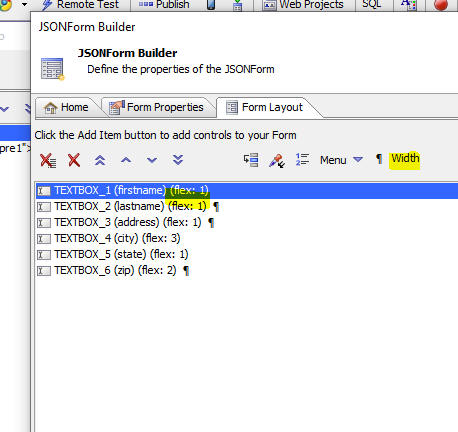
You can also set a field's width to an explicit size (for example, 100px), or a percentage.
Adjusting the placement of controls responsively
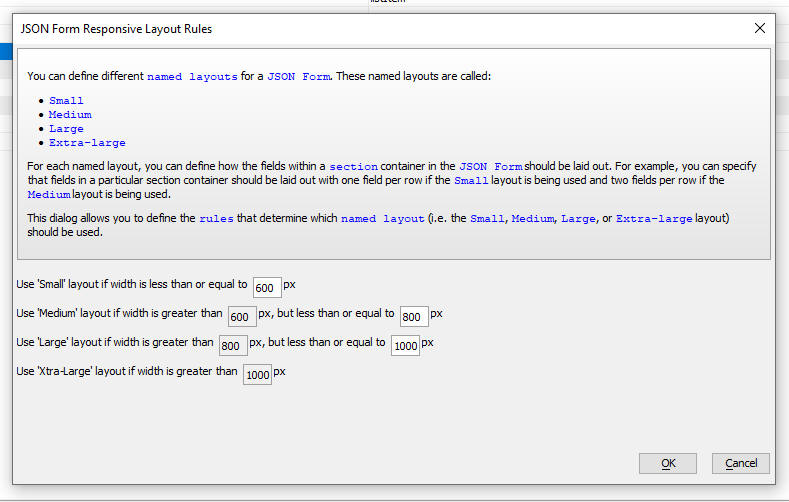
You can define layouts for different named Form sizes. The named sizes are Small (S), Medium (M), Large (L) and Extra Large (XL).
You can specify how each of the named sizes are defined by clicking the smart field for the Responsive rules property on the Form Properties tab.
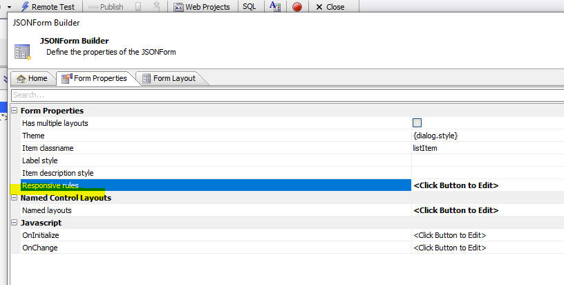
The builder allows you to specify how the different named sizes are defined.
To define a layout for a particular form size wrap the controls in a Section container.
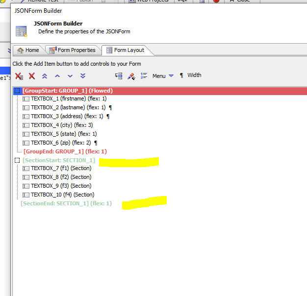
Then click the smart field for the Layout properties.
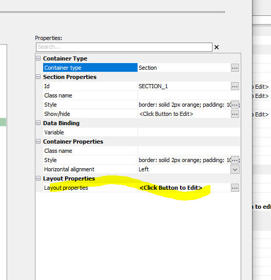
This will open a dialog as shown below.
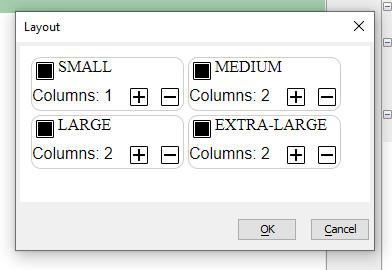
You can define the number of columns in the section for each of the named sizes. For example, in the image shown here, if the JSON Form is Small it will have 1 column, but if its size is Medium or larger, it will have 2 columns.
You can also specify the size and position of any control in a Section container for a given Form size.
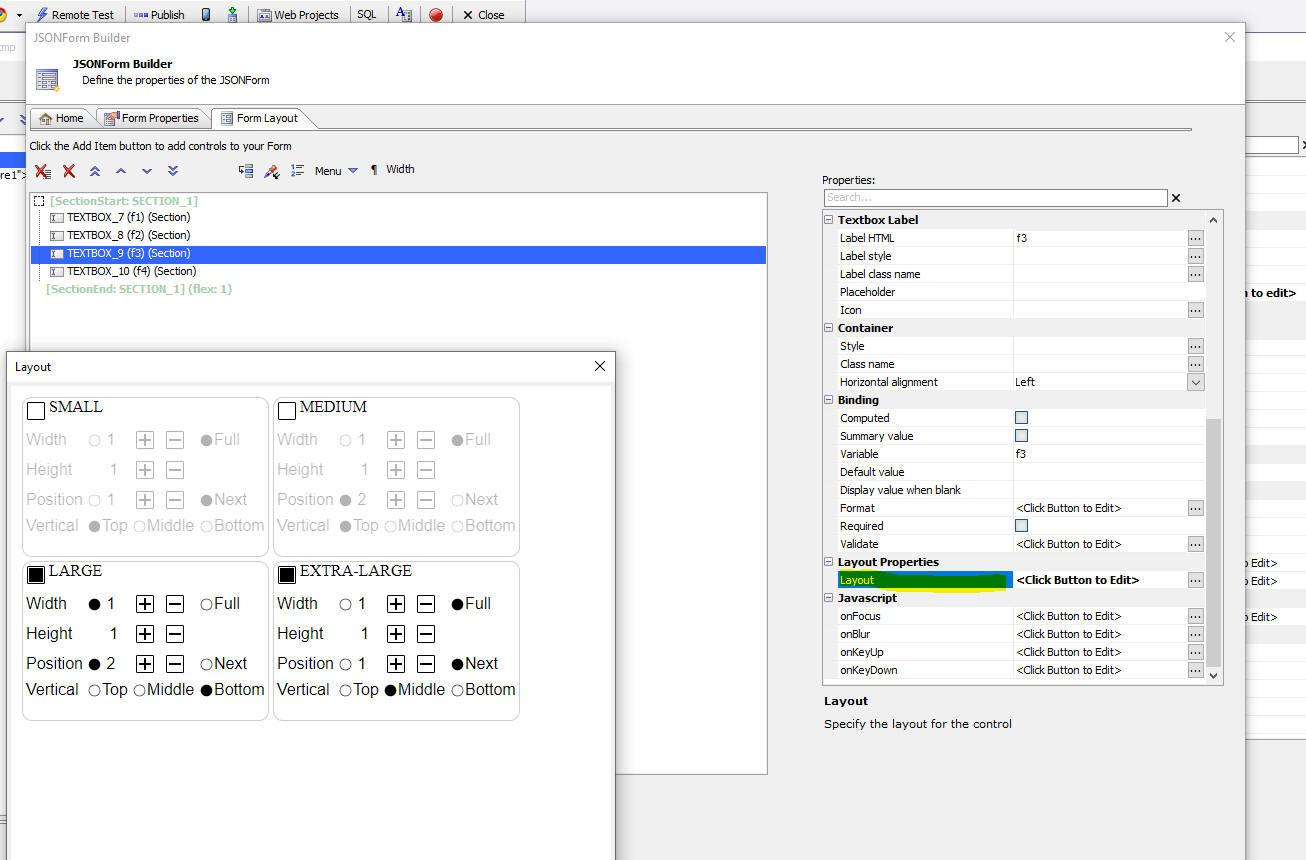
For example, in the image below the layout of TextBox_9 has been defined for the Large and Extra Large sizes. When the Form size is Large the control will be positioned in column 2 and when the Form size is Extra-large, the control will be the full width.
Videos
Video: Responsive Forms - Control Size
In this video we show how the size of the controls on the form can be adjusted automatically when the form size changes. This is done by setting the control's width to a flex value.
Video: Responsive Forms - Control Position
In this video we show how the placement for controls can be adjusted automatically when the form size changes. This is done by enclosing controls in a Section container and then setting properties for the Section layout.
See Also