JSON Forms - Original Release Features
- UX Component - Login - JSON Form
- Working with JSON data
- JSON Form definition example
- Reading values
- Reading values from individual controls
- Control name syntax
- How to build a JSON Form
- Control type categories
- Using the Quick Start Genie
- Using the Real-time Preview window
- Save JSON Forms to repository
- Load JSON Form from repository
- Understanding the Layout Property
- Computed and Summary Fields
- Computing Summary Values
- Configuring Read-only Fields
- Embedding Controls in a JSON Form
- Display Format
- Data driven forms
- Helper functions
- Action Javascript
- Data Binding
- Using the JSON Form Tester
- Responsive JSON Forms
- Adjusting the placement of controls responsively
- Using a JSON Form as the Detail View for a List
- Using the FieldMap Option with JSON Forms in a List with a Detail View
- Paginated JSON Forms
- Multiple Layouts
- Videos and Components
Description
This large page is a conversion of the original release document found here: https://aadocuments.s3.amazonaws.com/ReleaseNotes/JSONForms.html
This page does not show added features since build 9719. For better organization, this page was broken down into 5 pages, and these ARE updated with new features.
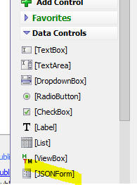
JSON Forms are a powerful control type (introduced in v4.6.5.0) that you can add to a UX Component. JSON Forms appear in the UX Builder toolbox in the Data Controls section of the toolbox.
JSON Forms are an alternative to adding individual controls to a UX. For example, before JSON Forms were introduced, if you wanted a UX component with these input controls, FirstName, LastName, Address, City and State, you would add 5 individual textbox controls to the UX.
However, using JSON Forms you can add a single control to the UX (a JSON Form control), and then you can edit the JSON Form control and add FirstName, LastName, Address, City and State input controls to the JSON Form.
The advantage of this approach is that the UX is much lighter weight (it has 1 control vs. 5 controls) and it is extremely fast. This advantage becomes more pronounced the more controls you have on a UX.
Another benefit of JSON Forms (besides being extremely light weight and fast) is that the form definition can be composed using either server-side code (for example, Xbasic, Python, Node.js), or client-side (JavaScript).
You can also store form definitions in a database.
UX Component - Login - JSON Form
The sample UX Login component has been rebuilt using JSON Forms. When you create a new login component from a UX you have the option of using individual controls for the login controls, or using a single JSON Form for all of the login controls.


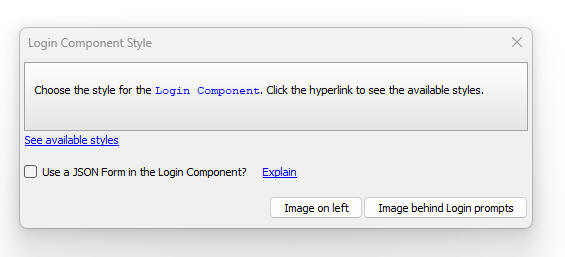
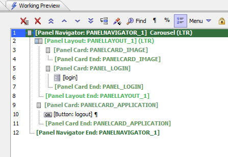
If you choose to use a JSON Form the resulting UX component has significantly fewer controls (as shown in the image below).
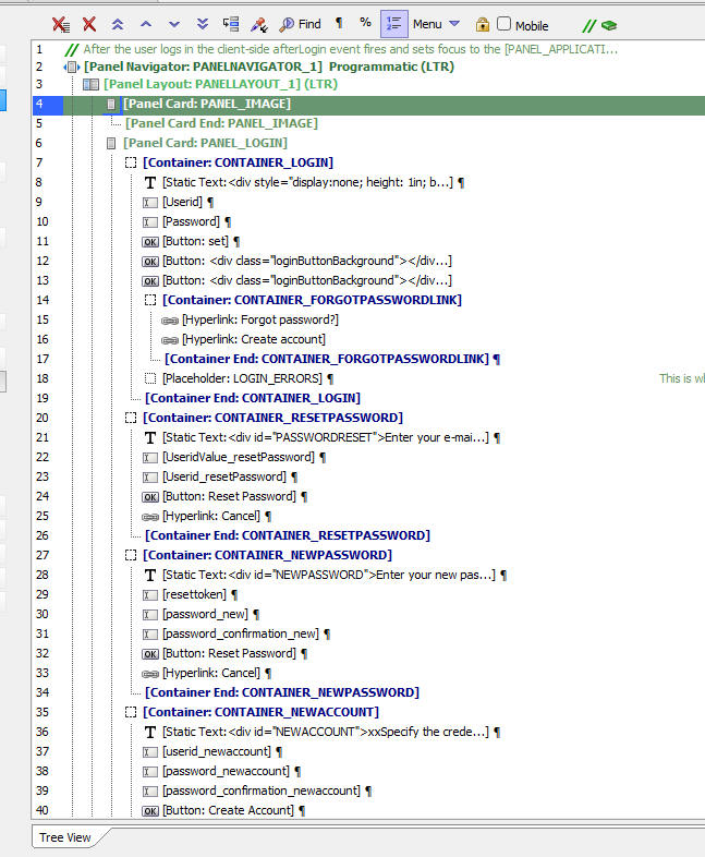
A UX login component built with individual controls has many more controls than the same component built using a JSON Form (as shown in the image below).
Working with JSON data
The reason that JSON Forms are considered to be a Data Control is that, like all other Data Controls, you can use the .getValue() and .setValue() methods to read and write the value in a JSON Form control.
The JSON data in a JSON Form is in JSON format and the definition of the JSON Form is also in JSON format, hence the name of the control type.
For example, consider a simple UX with a basic JSON Form that looks like this:
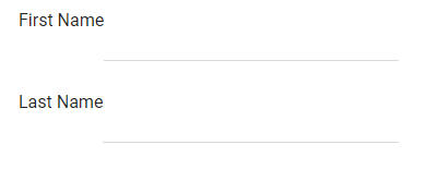
JSON Form definition example
The definition for this JSON Form is:
[
    {
        "type": "edit",
        "id": "TEXTBOX_1",
        "data": {
            "from": "First_Name"
        },
        "label": {
            "text": "First Name"
        }
    },
    {
        "type": "edit",
        "id": "TEXTBOX_2",
        "data": {
            "from": "Last_Name"
        },
        "label": {
            "text": "Last Name"
        }
    }
]
Reading values
When you read the data from the above JSON Form (using the .getValue() method), it might look something like this:
{"First_Name":"Fred","Last_Name":"Smith"}Reading values from individual controls
When you use the .getValue() and .setValue() methods on a JSON Form you are working with JSON data. However, the .getValue() and .setValue() methods can also be used on individual controls in the JSON Form.
For example, in the simple JSON Form above (which has a First Name and Last Name control), if you were to execute this method:
var val = {dialog.object}.getValue('FORM1')The value in val might be something like:
{"First_Name":"Fred","Last_Name":"Smith"}But say you wanted the value in the last_name variable, you could use the .getValue() method as follows:
var val = {dialog.object}.getValue("JSONFORM::Form1::last_name")Control name syntax
The syntax for the control name for both the .getValue() and .setValue() methods is:
JSONFORM::form name::variable name
The form name is case insensitive, but the variable name is case sensitive.
The JFORM prefix can be used as an alternative to JSONFORM.
How to build a JSON Form
To add a JSON Form to a UX component, select the [JSONForm] item from the toolbox.
This will add a blank JSON Form to the UX component.
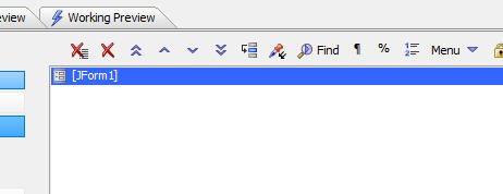
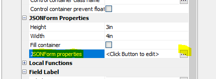
Then either double-click on the item in the list of UX controls, or click the smart field for the JSONForm properties property in the Property Grid.
This will open the JSON Form builder. You add controls (called items) to the JSON Form in much the same way that you add controls to a UX component.
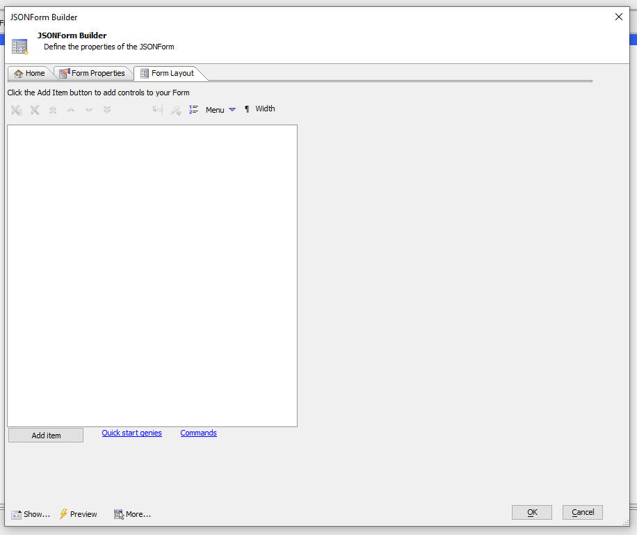
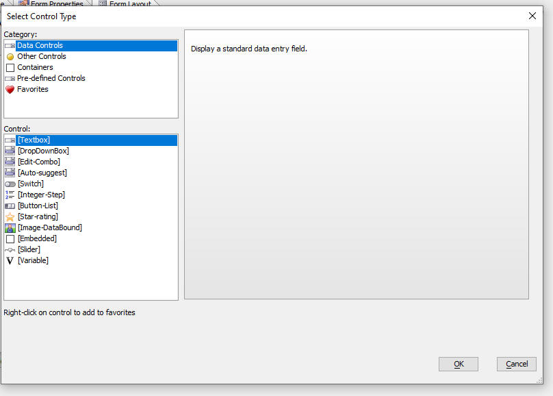
To add a control (i.e. item) to the JSON Form, click the Add Item button. This will open a dialog where you can select the control type to add.
Control type categories
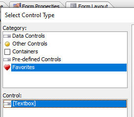
The Select Control Type dialog is divided into sections. The Data Controls section shows all of the controls that are bound to JSON data. These controls can be used to set values in the JSON data created by the JSON Form and to display data values.
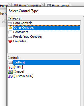
The Other Controls category allows you add buttons, HTML, images and custom controls (where you define the control by entering its JSON definition).
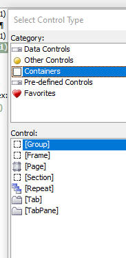
The Containers section allows you add different types of containers to your JSON Form. Containers are used to control the layout of the JSON Form.
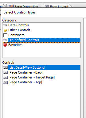
The Pre-defined Controls section allows you to add controls that are designed for a specific purpose.
For example, the [List Detail-View Buttons] control will add several buttons to a JSON Form that is being used as the Detail View for a List to save edits made in the JSON Form back to the List, to synchronize the List, etc.
You can add any control type to the Favorites section by right-clicking on the control and then selecting Add to favorites. To remove a control from the Favorites section, right click on the control in the Favorites section and select Remove from favorites.
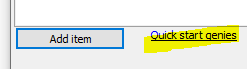
Another way in which you can create a JSON Form is by using the Quick start genies.
Using the Quick Start Genie
When you click on the Quick start genies hyperlink, the following dialog is displayed.
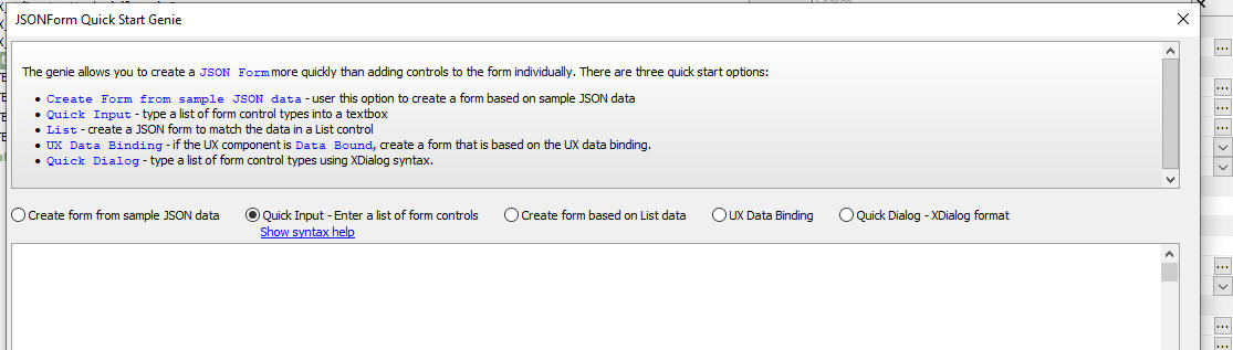
The Genie offers several types of quick starts. These are:
- Create form from sample JSON Data - This option allows you to enter sample JSON data and to create a form that can be used to create or edit JSON data in the same shape as the sample JSON data. The sample JSON data can include nested arrays.
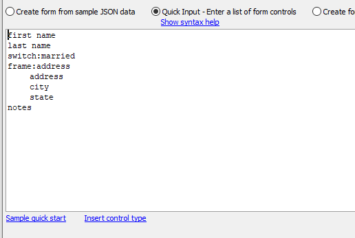
- Quick Input - This option allows you to enter a list of form controls and optionally specify the control type for each control (if you don't specify a control type, the control will be a textbox).
- Create Form based on List Data - This option allows you to select a List control in the UX and automatically build a JSON form to match the data structure of the List's data.
- UX Data Binding - This option applies when the UX is data bound.
- Quick Dialog - Xdialog Format - This option allows you to convert Xdialog syntax into a JSON Form.
Using the Real-time Preview window
When you are in the JSON Form designer you can open a Preview window to preview your form layout. The Preview window is modeless, which means that you can keep it open while you continue to work on your form design.
The Preview window is also hot - meaning that if you click on a control in the Preview window the focus in the Property Grid will move to the selected control. If you change a property value in the Property Grid, the Preview is automatically updated.
Save JSON Forms to repository
When you are in the JSON Form designer, you can save the form to the Repository (the Repository is a table in a SQL database). You can configure the Repository by going to the Project Settings dialog.
Once you have saved a form definition to the Repository you can load a form from the Repository.
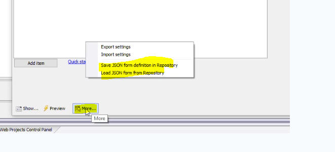
To save a form to the Repository, click the More.. button and select Save JSON form definition in Repository.
Load JSON Form from repository
You can load a form into the JSON Form designer from the Repository by clicking the More.. button and selecting Load JSON form definition from Repository.
Action Javascript - load from repository
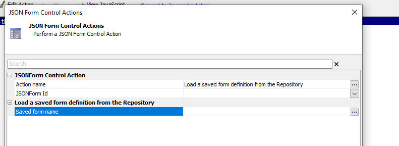
At run-time you can load a JSON Form definition from the Repository into a JSON Form control in the UX. To do this, select the JSONForm Control Action when you define an Action Javascript action.
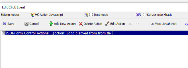
Then select the Load a saved form definition from the Repository action, and specify the target JSONForm id and the Saved form name.
Understanding the Layout Property
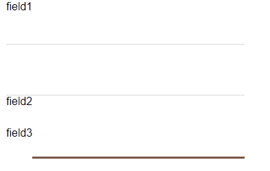
Every control in a JSON Form has a Layout property that controls how the different parts of the control (i.e. the control itself, its label, its help text, etc.) are rendered. The JSON Form builder has a number of different pre-defined layout styles. You can also create your own named layout styles.
For example, in the image below, the label for field1 is shown above the control, the label for field2 is shown below the control and the label for field3 is shown to the left of the control.
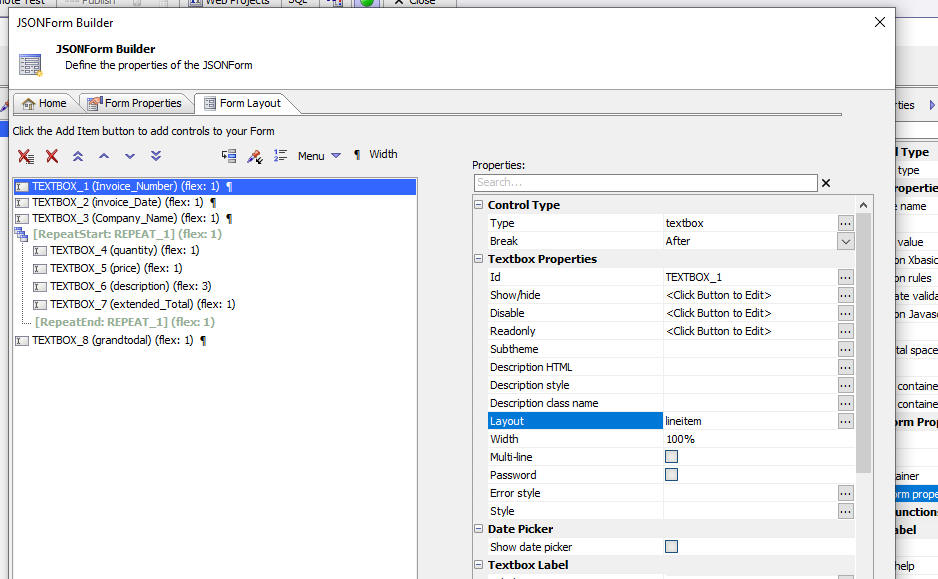
When you click on the smart field for the Layout property, a dialog is opened showing all of the available named layout styles. The styles shown in green are the system styles and they cannot be edited or deleted.
The styles shown in blue are the user-defined styles.
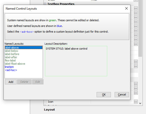
To add a new named layout style, select the <ad-hoc> option and then click the Edit button. The builder for the layout definition will then open.
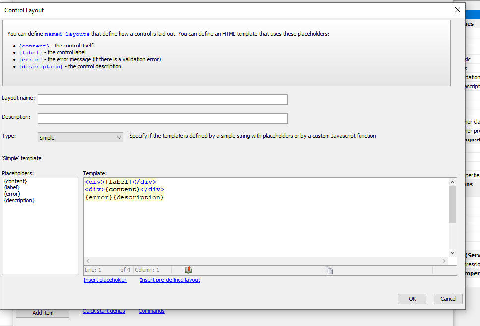
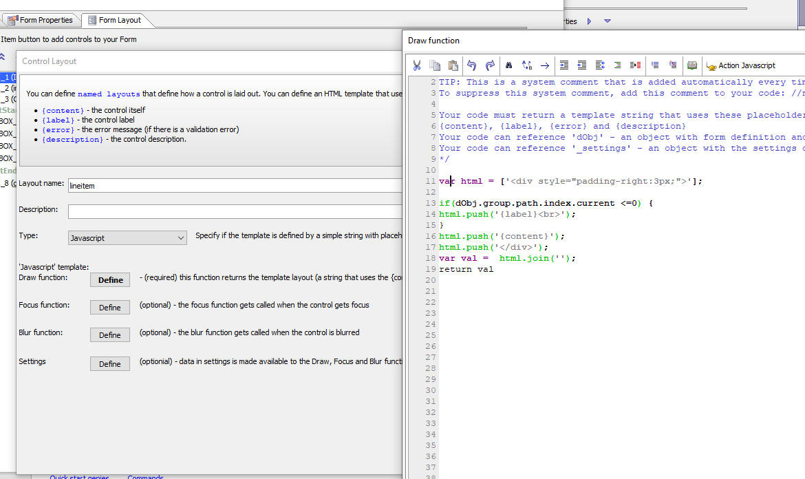
There are two ways to define a new layout:
- Simple
Define an HTML template with placeholders for different control parts.
- Javascript
Javascript code.
The builder for the Simple mode is shown below.
The builder for the Javascript mode is shown below:
Computed and Summary Fields
It is common when defining a form to define computed values. For example, in an invoice form you will likely have a price and quantity field for each invoice line item and you will typically want to compute the extended total (price * quantity) for each line in the invoice line items section.
Computed values are defined using Javascript code. To define a computed value, check the Computed property.
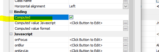
Then click the smart field for the Computed value Javascript property and define the Javascript. For example:
return Number(data.price ) * Number(data.quantity)
You can also format the computed value by defining a format in the Computed value format property.
When you are defining a computed value for fields in a Repeat group (for example, in an invoice form where the line items are in a Repeat group), the expression you define will refer to values in the current Repeat instance (for example, if your Repeat group has two rows and the price and quantity in the first row are 5 and 3 respectively, the expression Number(data.price) * Number(data.quantity) will evaluate to 15. If the second row in the Repeat group has 4 and 6 in the price and quantity fields, the computed value for this row will be 24).
Computing Summary Values
If your JSON Form has any Repeat groups you can compute a summary value for any of the fields in the Repeat group. Summary fields are only meaningful if the JSON Form has a Repeat group.
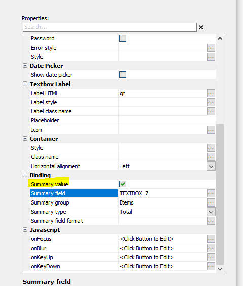
Check the Summary field property and specify the following settings:
- Summary field - This is the field you want to summarize. For example, say your JSON Form has a Repeat group (called, say, items) with these fields: price, qty and extendedTotal. In this example, the Summary field is extendedTotal and the Summary group is items.
- Summary group - This is the Repeat group that contains the Summary field.
- Summary type - This is the type of summary computation you want to perform (for example, count, total, average).
Configuring Read-only Fields
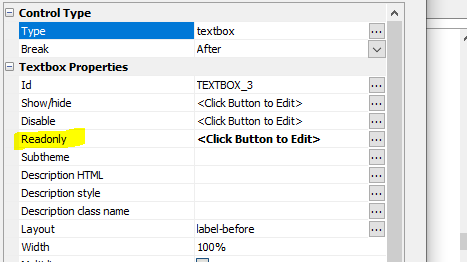
It is typical to set computed and summary fields to be readonly by setting the JavaScript in their Readonly property to this:
return true;
Embedding Controls in a JSON Form
You can embed standard UX Controls within a JSON Form. For example, you might have a ViewBox control that you would like to embed in a JSON Form.
To embed a UX control in a JSON Form, edit the JSON form and add an [Embedded] control (from the Data Controls section in the dialog that appears when you click the Add item button) at the location in the form where you want the embedded control to appear.
![Adding an [Embedded] control to a JSON Form.](images/embed1.jpg)
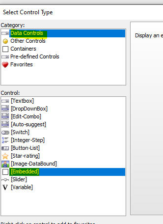
Then specify the id of the control you want to embed by clicking the smart field for the Control id property.
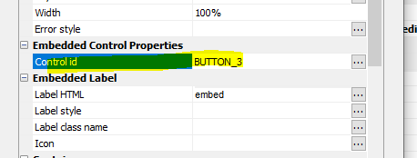
When you use .getValue() to get the value of a JSON Form, the embedded control's value is included in the JSON for the JSON Form's value. Similarly, when you use the .setValue() method to set the value of a JSON Form, the value of any embedded controls will also be set.
Display Format
You can define a Display Format for a field in a JSON Form. When the control has focus, the raw data in the form is shown. When the control loses focus, the formatted value is shown. For example, in the images below the formatted date is shown for the n3 field. In the second image, the raw value in the field is shown.

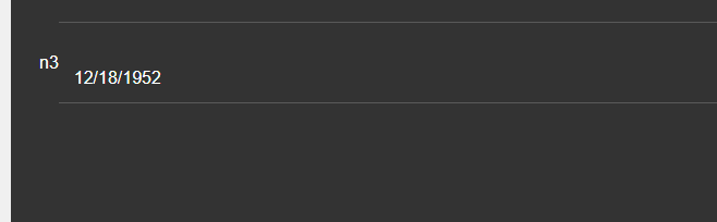
The following types of Display Formats can be defined:
- Character
- Numeric
- Date
- Friendly date
- Custom
When you select the Custom option you can define Javascript code to return the formatted value. Your Javascript code can reference the raw data in the field.
For example, you might define the following Javascript code to add a leading $ to the value in the field:
return '$' + v
Data driven forms
A data driven form is a form that is dynamically generated from a list of questions. These questions are typically looked up in a database (or an Excel spreadsheet) and then converted into a form definition when an Ajax callback is made to the server to load a particular form.
See: Data Driven JSON Forms video 1 Data Driven JSON Forms video 2
For example, assume you have a database with the following sample data:
FormId | Prompt | Type | Variable | Page | Choices | ShowHide | Disable | Readonly |
form1 | First name | textbox | fname | Home | ||||
form1 | Last name | textbox | lname | Home | ||||
form1 | Date of birth | textbox-datepicker:dd/MM/yyyy | dob | Home | ||||
form1 | Are you married? | switch | married | Home | ||||
form1 | Favorite color | button-list | favoriteColor | Home | red,green,blue | |||
form1 | Address | textbox | address | Address | ||||
form1 | City | textbox | city | Address | ||||
form1 | State | textbox | st | Address | ||||
form1 | Zip | textbox | zip | Address | ||||
form1 | Home Phone | textbox | phone_work | Phone | ||||
form1 | Work Phone | textbox | phone_home | Phone |
An Excel file (called datadrivenjsonform.xlsx) with this data is available in the MDBFiles folder in the folder where Alpha Anywhere is installed.
The sample data defines a form with several questions. The form has several control types and the questions are organized into 3 pages - Home, Address and Phone.
Notice that the Date of birth field specifies that the field is a date picker and the format for the date is set to dd/MM/yyyy.
For each field you can specify showhide, disable and readonly expressions. These expressions must be defined using JavaScript and the expressions must return a true or false value. Your JavaScript can reference values in other fields in the form by prefixing the variable name with data. For example, to reference the value in the First Name field (variable is fname), you can use data.fname.
If the showhide expression returns true, the field is shown. If it returns false, the field is hidden.
If the disable expression returns true, the field is disabled.
If the readonly expression returns true, the field is read-only.
You might have a button on your UX component to make an Ajax callback and load the questions (i.e. controls) for a particular form (for example, form1).
For example, the image below shows a UX with an empty JSON Form and a button that makes a callback to load a particular form.
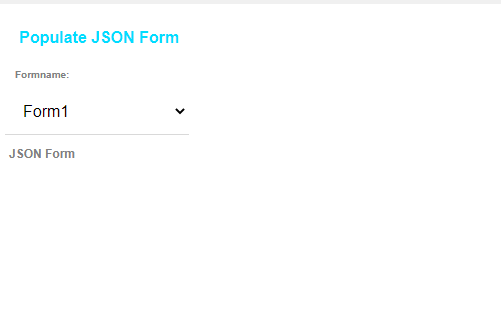
Here is an example Xbasic function that handles the callback and returns the JavaScript to load the JSON Form.
function xb as c (e as p)
    dim formname as c = e.dataSubmitted.formname

    dim fn as c
    dim cs as c
    dim table as c
    fn = a5.Get_Exe_Path() + "\MDBfiles\datadrivenjsonform.xlsx"
    cs = fn
    table = "DataDrivenJSONForms"

    dim style_name as c = e.tmpl.style_name

    dim def as c = A5Helper_getJSONFormitems_fromDatabase(cs,table,"FormId",formname,style_name)

    dim js as c
    js = "var items = " + def + ";" + crlf()
    js = js + "{dialog.object}.setJSONFormItems('jf',items);"
    xb = js
end function
Helper functions
The following Xbasic and JavaScript functions are used in the Xbasic function above.
A5Helper_getJSONFormitems_fromDatabase()
This function will query a SQL database (or an Excel file) to get the definition of a data driven JSON form.
Syntax:
Where
- definition - The JSON array of JSON Form items to be loaded into the JSON Form using the JavaScript function {dialog.object}.setJSONFormItems().
- cs - The connection string to the database where the form definition is stored. If the definition is stored in an Excel file, then the fully qualified Excel filename.
- tablename - The table in the database where the form is stored. In the case of an Excel file, the name of the Excel sheet.
- formnamefield - Name of the field in the table where the form name is stored.
- formname - Name of the form you want to load. Can be a comma delimited list of form names.
- style_name - The style of the UX component that hosts the JSON form.
C definition =
A5Helper_getJSONFormITEMS_fromDatabase(C cs, C tablename, C formnamefield, C formname [, C style_name])
{dialog.object}.setJSONFormItems(JSONFormName, Items)
This JavaScript function populates a JSON form with the items defined in the Items parameter.
Where:
- JSONFormName - The name of the JSON Form to populate.
- Items - An array of objects that define the items to populate the JSON Form with. (The Xbasic A5Helper_getJSONFormitems_fromDatabase() function is often used to generate the items array.)
Another way in which the Items array can be generated is using the Xbasic a5wcb_jsonFormItems_from_commands() function or the a5Helper_GenerateJSONFormDefinition_From_SampleData() function.
The a5wcb_jsonFormItems_from_commands() function takes a series of commands (same syntax as is used for the Quick Input option in the JSON Form Quick Start Genie) and generates an array of JSON Form items that you can then use with the {dialog.object}.setJSONFormItems() method to populate a JSON form.
The a5Helper_GenerateJSONFormDefinition_From_SampleData() function generates a JSON Form definition from sample JSON data.
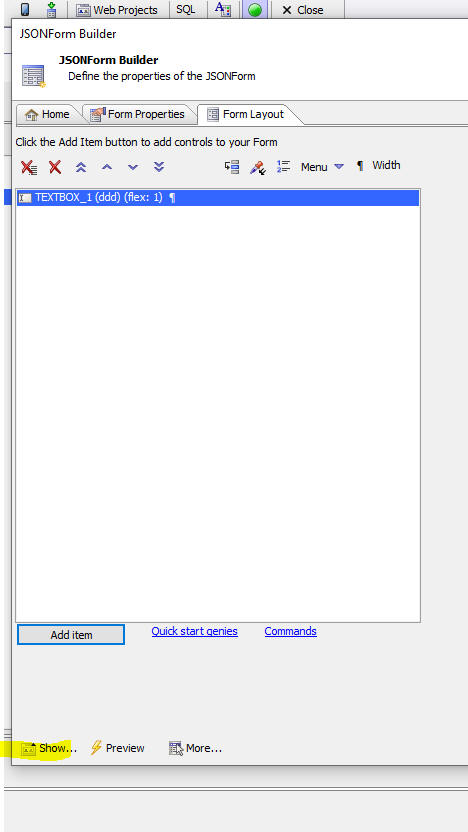 Show JSONForm Items
An easy way to generate the Items array is to build a JSON Form using the builder. Then click the Show... button and select the JSONForm Items (JSON) command from the pop-up menu.
a5wcb_jsonFormItems_from_commands()
Syntax:
Where
- definition - The array of JSON Form items.
- commands - The Quick Start commands used to generate the items.
Example:
You could then use the generated items to populate a JSON form. For example:
C definition = a5wcb_jsonFormItems_from_commands(C commands)
a5Helper_GenerateJSONFormDefinition_From_SampleData()
Syntax:
Where
- definition - The array of JSON Form items.
- JSONData - The sample JSON data.
Example:
You could then use the generated items to populate a JSON form. For example:
C definition = a5Helper_GenerateJSONFormDefinition_From_SampleData(C JSONData)
Action Javascript
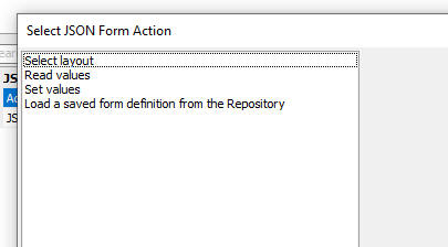
The JSONForm Control action in Action Javascript offers a number of actions.
Data Binding
When you create a UX component you can specify that the UX is databound. This allows you to define how fields in a SQL database are bound to controls on the UX.
You can then navigate through the records in the database and make edits to the values shown in the UX and then, when you click the Submit button, your edits are applied to the database.
By default, when you bind a UX to a database, you define individual controls for each field in the SQL table. However you can also use a JSON Form for Data Binding.
See: Data Binding Video
Using the JSON Form Tester
The JSON Form Tester window allows you to experiment with the JSON definition of a JSON Form to see how the form will render.
Responsive JSON Forms
JSON Forms are responsive. You can change the size and position of a control automatically based on the size of the form.
See: Responsive Control Size Video Responsive Control Position Video
For example, on a phone, you might want one field per line, whereas on a tablet you might want 2 fields per line in one section of the form and 3 fields per line in another section of the form.
To make a control's size responsive you set the control width to a flex value. For example, in the image below, the firstname and lastname fields are on a line (because there is no break after firstname, but there is a break after lastname) and both controls are the same width (flex 1).
Line breaks are indicated by the paragraph symbol and you can toggle the line break on or off by clicking on the linebreak button (paragraph symbol) on the toolbar.
Address is on a line by itself and it spans the entire width of the form.
City, State and Zip are on a single line and the City (flex 3) field is 3 times the size of the State (flex 1) field and the Zip (flex 2) field is twice the size of the State field.
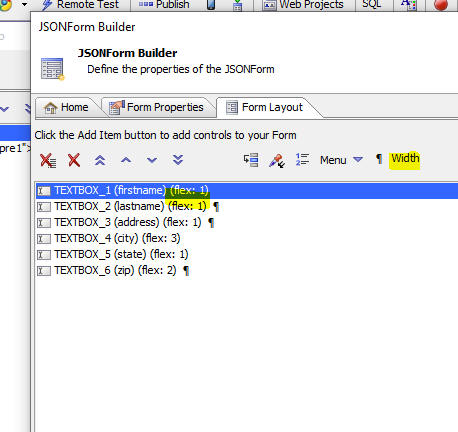
You can also set a field's width to an explicit size (for example, 100px), or a percentage.
Adjusting the placement of controls responsively
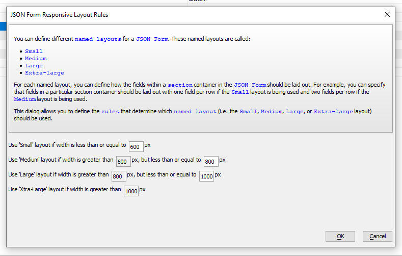
You can define layouts for different named Form sizes. The named sizes are Small (S), Medium (M), Large (L) and Extra Large (XL).
You can specify how each of the named sizes are defined by clicking the smart field for the Responsive rules property on the Form Properties tab.
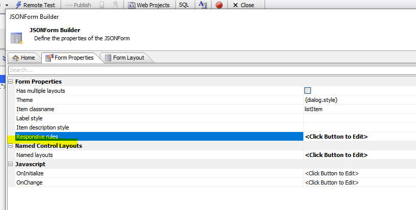
The builder allows you to specify how the different named sizes are defined.
To define a layout for a particular form size wrap the controls in a Section container.
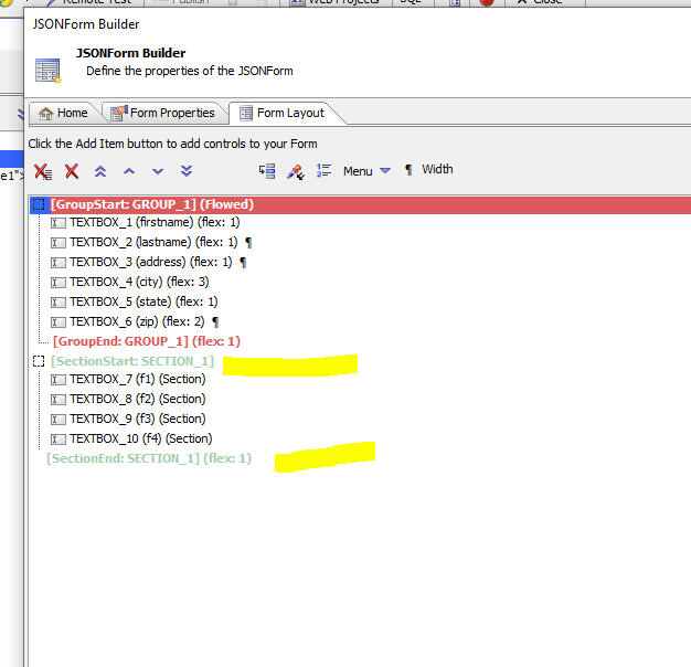
Then click the smart field for the Layout properties.
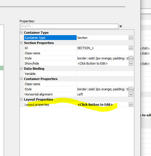
This will open a dialog as shown below.
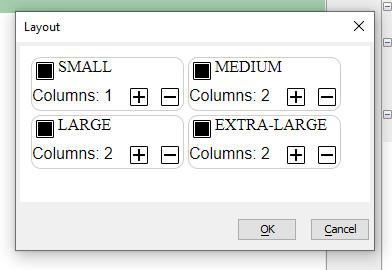
You can define the number of columns in the section for each of the named sizes. For example, in the image shown here, if the JSON Form is Small it will have 1 column, but if its size is Medium or larger, it will have 2 columns.
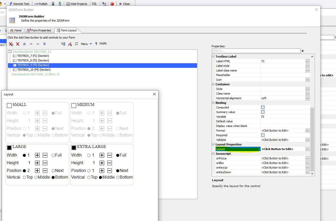
You can also specify the size and position of any control in a Section container for a given Form size.
For example, in the image below the layout of TextBox_9 has been defined for the Large and Extra Large sizes. When the Form size is Large the control will be positioned in column 2 and when the Form size is Extra-large, the control will be the full width.
Using a JSON Form as the Detail View for a List
You can specify that the Detail View for a List is a JSON Form. The JSON Form itself can either be pre-defined (i.e. designed by you), or it can be generated automatically.
When you generate the form automatically, you have the choice of generating the JSON Form client-side or server-side.
If every row in the List has the exact same structure (as is typically the case when the List is based on a SQL query), then there is no benefit in generating the JSON Form client-side. However, if some of the rows in the list have different structures (as might be the case if the List is based on a NoSQL database), then using the client-side option means that the JSON Form matches the structure of the List data for the selected row.
To set a JSON Form as the List Detail View, select JSONForm at the DetailView type property.
Then specify if the JSON Form is pre-defined, or generated automatically, by selecting an option for the JSON Form definition property. The options for this property are:
- Pre-defined
- Auto-generated-server-side
- Auto-generated-client-side

Using the FieldMap Option with JSON Forms in a List with a Detail View
When you set the Detail View type to a JSON Form, you pick a single JSON Form as the List's Detail View.
However, if you set the Detail View type of FieldMap you can map List fields to individual controls in any JSON Form in the UX component.
For example, in the image below, the CustomerID List column can be mapped to the CustomerID control in JSON Form 'JForm1'. Similarly, the City List column can be mapped to the City control in JSON Form 'jform2'.

Paginated JSON Forms
When you have a large JSON Form, it is often desirable to divide the form into multiple logical pages.
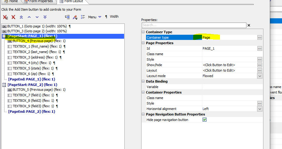
In order to create a Paginated form, you wrap the controls for each page in a Page container.
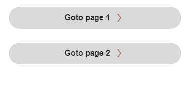
When the JSON Form is rendered, default page navigation buttons will be shown.
If you want full control over the page navigation buttons, turn off the default page navigation buttons (by checking the Hide page navigation button property) and add your own buttons to the form (by selecting buttons from the Pre-defined controls section when you click the Add item button).
The Javascript for your buttons can use these methods:
- this.navigate('page-in','id_of_page_container');
For example: this.navigate('page-in','PAGE_2');
- this.navigate('page-back');
- this.navigate('page-top');
Multiple Layouts
Like Lists, ViewBoxes and ControlBars, JSON Forms can have multiple Layouts.
You can use Action Javascript to switch layouts. Select the Selection layout action in the Action type for the JSON Forms action.
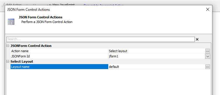
The JavaScript to change layouts is shown below:
var obj = {dialog.object}.getControl('JFORM1'); // get a pointer for JFORM1
obj.uxSelectLayout('DEFAULT');
Videos and Components
Introduction to JSON Forms
The Preview Window
In this video we show how you can use the Preview window in the JSON Form designer to get a real-time preview of your JSON Form as you design it.
.GetValue() and .setValue()
In this video we show how the standard UX component .getValue() and .setValue() method work with a JSON Form. We also show how JSON Form data are submitted to the server when the UX is submitted.
.GetValue() and .setValue() on Individual JSON Form fields
In this video we show how the .getValue() and .setValue() methods can operate on individual controls in the JSON Form.
Defining a summary calculation for a field in a Repeat group
In this video we show how to add calculated and summary fields to a JSON Form. (Summary fields are only meaningful if the JSON Form contains a Repeat group).
How to create tab and accordion controls
In this video we show how to create Tab and Accordion controls in a JSON Form.
How to Create Paginated Forms
When you have a large JSON Form it is often desirable to divide the form into multiple logical pages. In this video we show how a form can be divided into multiple pages.
Video: Responsive Forms - Control Size
In this video we show how the size of the controls on the form can be adjusted automatically when the form size changes. This is done by setting the control's width to a flex value.
Video: Responsive Forms - Control Position
In this video we show how the placement for controls can be adjusted automatically when the form size changes. This is done by enclosing controls in a Section container and then setting properties for the Section layout.
Video: Data Driven JSON Forms
A data driven form is a form where the questions shown on the form are retrieved from a database. If you want to add a new question to the form you don't have to edit the form. You just edit the database that lists the questions.
Using a JSON Form as the List Detail view - Pre-defined Layout
In this video we show how you can define a JSON Form as the Detail-View for a List Control. The structure of the Detail View is pre-defined at design-time.
Using a JSON Form as the List Detail view - Auto-generated (Server-side)
In this video we show how you can define a JSON Form as the Detail-View for a List Control. The structure of the Detail View is automatically generated at run-time to match the structure of the data in the List.
Using a JSON Form as the List Detail view - Auto-generated (Client-side)
In this video we show how you can define a JSON Form as the Detail-View for a List Control. The structure of the Detail View is automatically generated (on the client) at run-time to match the structure of the data in the List. Because the JSON Form is generated client-side each row in the List could have a different structure.
How to dynamically set the structure of a JSON Form
In this video we show how you can dynamically set the structure of a JSON form using a Javascript function.
Data Bound UX Component Using JSON Forms
In this video we show how you can create a Data Bound UX component using JSON Forms to edit data in a SQL table.
Saving JSON Form definitions in the Repository
In this video we show how you can save JSON Forms in a 'repository' (a SQL database) and then dynamically load forms from the repository at run-time.
Using the JSON Form Tester
The JSON Form tester allows advanced users to experiment with different JSON definitions. In this video we show how the JSON Form Tester can be used.
Defining Display Formats for Fields
In this video we show how you can define display formats for fields in a JSON Form. For example, you might want to display a field with a leading $ sign, but when the field has focus so that you can edit the value in the field, you might want to display the raw (unformatted) value in the field.
Dynamic Filters on Dropdown, Combo and Edit-combo Controls
A common requirement for controls with picklists (e.g. dropdown, or combo controls), is to dynamically filter the choices in the picklist. For example, if your form has a picklist for Country and one for City, you typically only want the choices in the City picklist to show cities in the selected Country.
See Also